The Loop Chapter

OVERVIEW
The project focused on designing a unique identity and website for a crochet lifestyle brand, that showcased the essence of the brand. You can see their website at https://theloopchapter.com
2025
Task
CHALLENGE
As a small, all-female handmade business in a crowded gifting market, The Loop Chapter needed more than a pretty aesthetic. Customers had to trust that a crochet flower was worth the price they were paying.
Without a cohesive brand identity (logo, tone, visual system), the product's quality wasn't translating into perceived value.
The brand strategy was rooted in the idea of creating "loops" of slow and cosy habits, creating a warm atmosphere for the brand. It also tied into the crochet technique, while "chapter" brings in this idea of personal stories and volumes.
We branded this to feel like a warm hug, with tones of green to add to the eco-consciousness. It also represents the growth that comes from indulging in these habits for ourself. The soft pink also adds a calm feeling, combined with nurturing.
THE LOGO
A visual representation of what the brand stands for
The word “loop” is the heart of the design. The line going through the Os reflects the movement of the thread and the handmade feel of crocheting. Its fluid form adds a sense of warmth and creativity, hinting at the nature of the craft.
In contrast, the cleaner type used for “the” and “chapter” adds structure and consistency, helping frame the playful middle word. This contrast keeps the logo easy to read while still letting “loop” stand out with personality.
gardens, growth, and the organic imperfection of handmade things. The wavy line motifs echo the rhythm of crochet stitches — not rigid, not mechanical, but alive and flowing. The layered greens reference the stems, leaves, and natural depth you'd find in a real bouquet, grounding the brand in its botanical identity.
PACKAGING DESIGN
The packaging draws from the world the products already live in:
gardens, growth, and the organic imperfection of handmade things.
The wavy line motifs echo the rhythm of crochet stitches; not rigid, not mechanical, but alive and flowing.
The layered greens reference the stems, leaves, and natural depth, grounding the brand in a botanical identity.


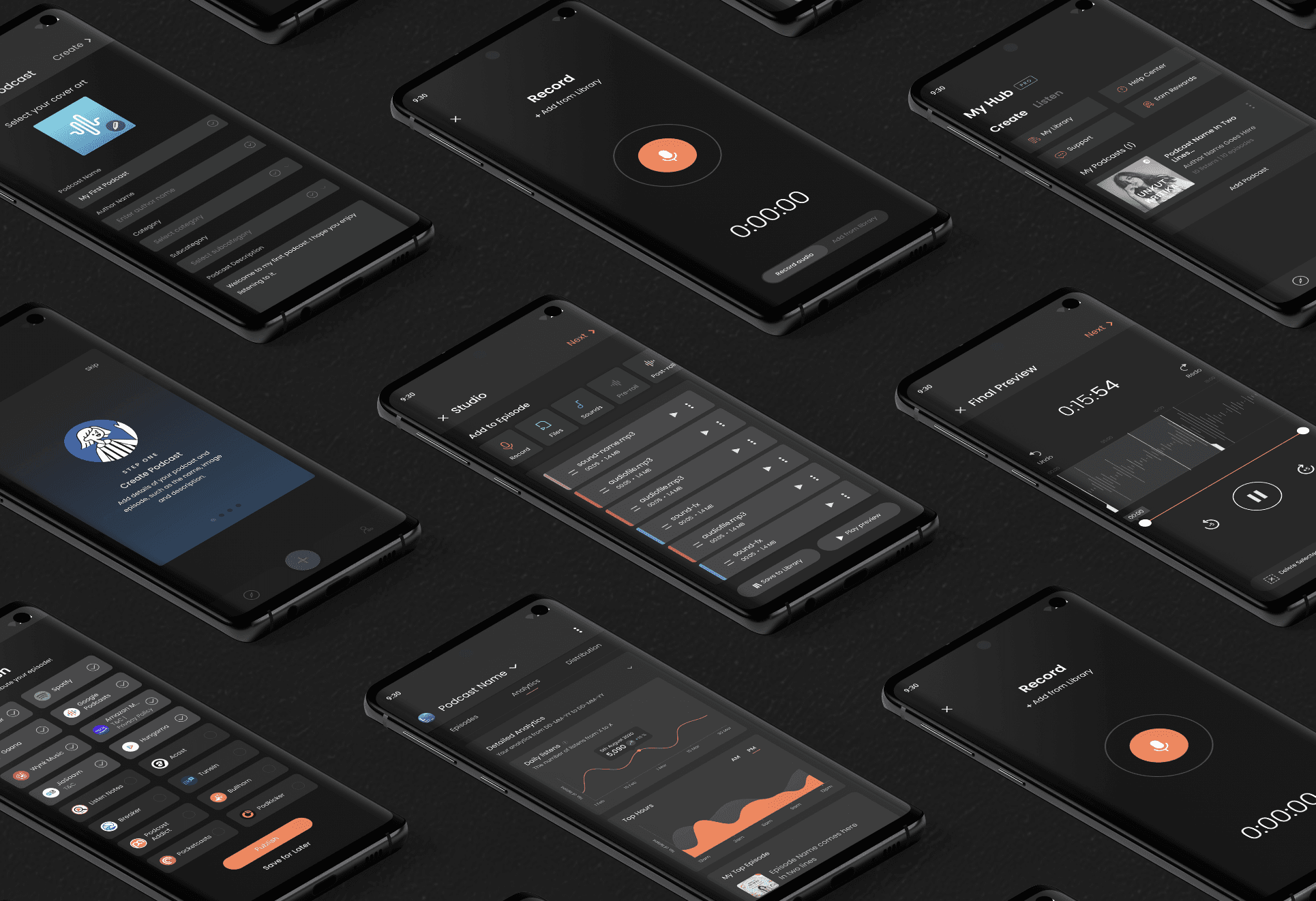
MY ROLE
I designed the end-to-end experience for the Hubhopper mobile app. During this process I worked closely with the Head of Design to design the experience, and worked cross collaboratively with the Engineering and Marketing teams.
Main Responsibilities:
1. User Research (Feedback, Data Analysis, Competitor Analysis)
2. Planning (Prioritising Features, Release Cycle)
3. Design (Wireframes, Prototypes, Iterations, Testing)