Hubhopper Landing Page

OVERVIEW
While trying to increase the number of trials led the redesign of the landing page, targeting first-time visitors. We wanted it to be visually engaging, informative, and optimised for conversion without overwhelming new users.
Hubhopper
2025
Web, Mobile
UX Lead + PM

IMPACT
The changes in the landing page focused on providing value to the user and ensuring that all communication was user-centric, highlighting benefits of the product from the user's point of view. The CTR increased from 37% to 52%.
CHALLENGE
To overhaul the website to represent the brand while increasing the signups & payments.
The original landing page struggled to communicate Hubhopper's evolving value in a competitive market. New visitors needed an entry point that didn't just host their podcast but promised growth.
My challenge was to transform this critical first touchpoint into a clear, high-intent experience that addressed podcasters' pain points early on in their journey.
SOLUTION
Providing the user with value based on their actual requirements.
I restructured the layout to move Hubhopper from a 'podcast host' to a platform that helps you 'grow your podcast'. By focusing on high-value points like 'Audio & Video Podcasting' and '15+ Platforms", we aligned the page with the changing needs of podcasters.
I broke the page down into a hierarchy that highlighted these unique features. This realignment of the product’s core value proposition successfully increased the CTR to 52%, representing a significant increase in user interest and intent.
THE PROCESS
Understanding what wasn't serving the user
I used insights from user interviews and surveys to identify which features mattered most to creators today. The data revealed a critical behavioural insight: Over 75% of our users didn’t scroll past the top 25% of the screen. Because of this, we moved the most compelling features, such as distribution, video podcasting and unlimited podcasts, into the hero and top fold of the page.
This ensured that the most valuable information was captured within the initial scroll window, directly
contributing to the 15% lift in CTR.


DETAILED ANALYSIS
COMPETITOR ANALYSIS
I started off by assessing the competitive landscape.
Analysing competitor landing pages helped me understand how podcast creation was being framed, what expectations were being set, and what features other players in the industry were focusing on.
The analysis focused on:
Primary value proposition
Audience targeted
Complexity of language used
Feature framing

PRIMARY RESEARCH
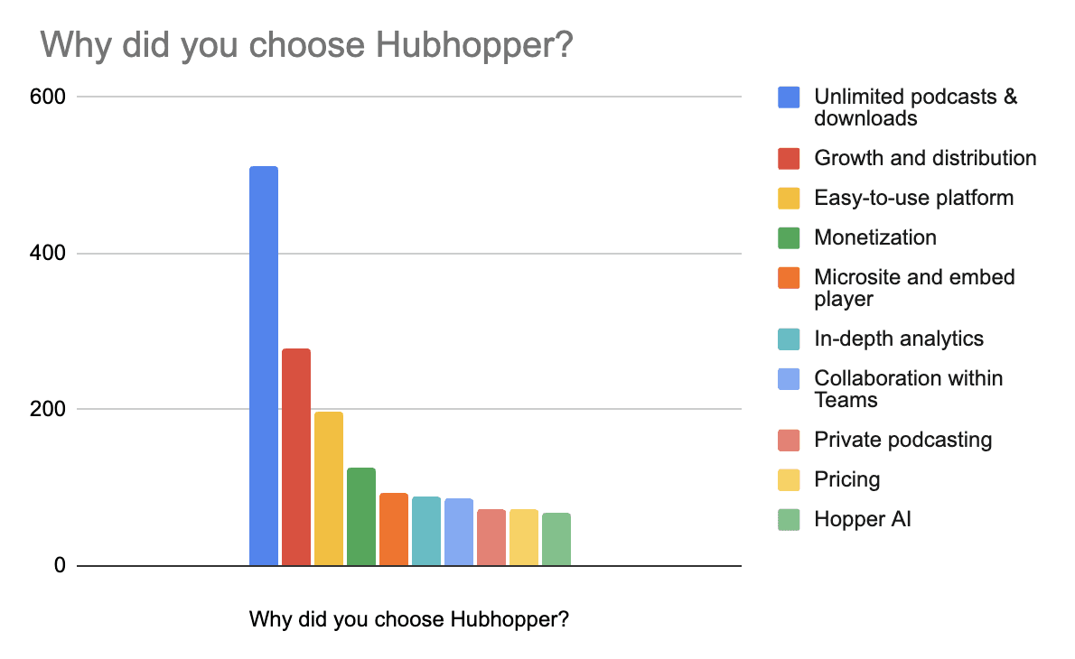
I began a quick survey two months before the landing page overhaul to ask users what mattered to them.
It helped me understand the users and their needs better. The data was from approximately 1000 users.
Based on the data, users were using podcasting to 'Boost their Business'. They wanted a platform that was easy-to-use, had no limits to creation/reach and promoted growth and distribution.

41%
Online Search
21%
Blogs & Articles
8%
Reviews
21%
Social Media
9%
Referrals
Platform Discovery
Building trust became an important part of the landing page, since over 40% of users discovered the platform through online search.
WIREFRAMES
Highlighting key features in the first fold of the page was essential.
Active User Community
Ratings
Easy-creation
Audio & Video Podcasting
Unlimited Downloads & Podcasts
followed by other key features, such as AI-Powered Tools, Microsites & Dynamic Audio Insertion.


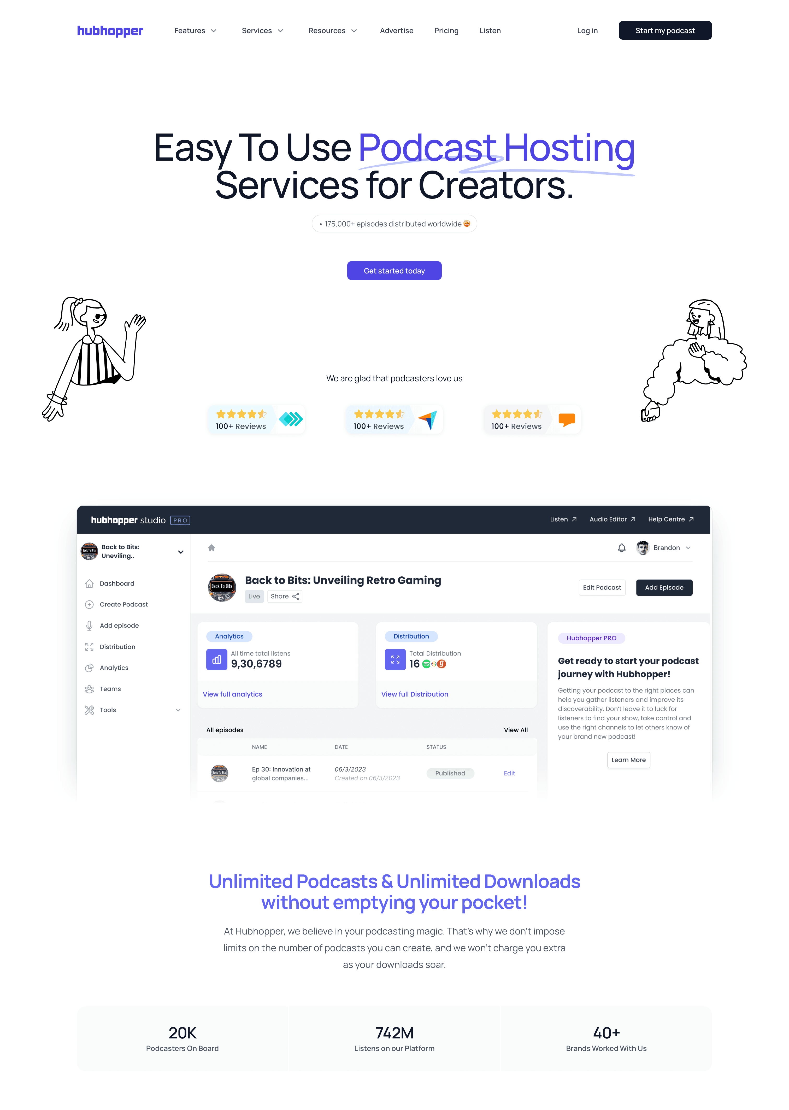
FINAL DESIGN

MY ROLE
Main Responsibilities:
User Research (Interviews, Surveys, Secondary Research)
Design (Wireframes, Prototypes, Iterations, Testing)
Assessing Impact